How to Style a Bookshelf When You Have a Lot of Books
I'm not going to deny it, I love looking at a perfectly styled shelf with plenty of breathing room and lots of interestingly displayed objects. There are many great posts out there that break down the formula for your perfectly styled bookshelf and this post isn’t that!
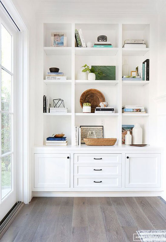
Gorgeous white custom bookshelves and styling by Amber Interiors.
However, many of us need our bookshelves to act as just that, a place to hold our books. Don't feel bad if you don't have all leather and gold bound books or a separate room in your house just to hold your well worn and dog-eared paperbacks. There are ways to make bookshelves with majority books look a little more curated and I can show you how. I've got three great tips for making your bookshelf look a little more styled.
1. Vary Horizontal and Vertical Stacking
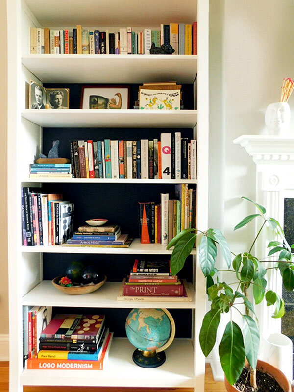
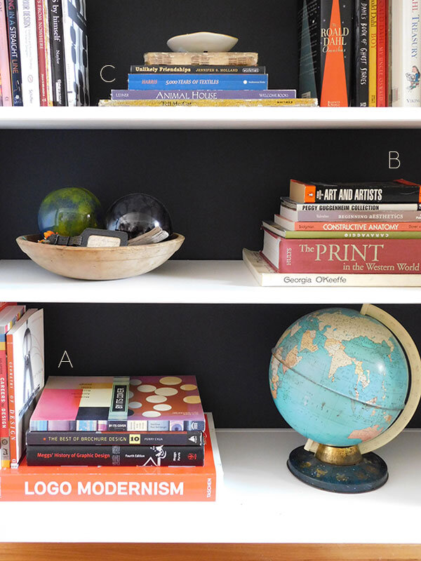
I like to start by dividing up all my books by size. This way I can grab books to work with easily. I start by making a few horizontal stacks that can be my anchors, see A, B and C. If you like the size of a book in your stack, but the title is silly or the color doesn't work, just turn it around. No one will notice! Horizontal stacks tend to be bigger books so I like to place them near the bottom of the bookshelf and vary their placement in a zig zag. If you have some larger objects it's nice to place them on these lower shelves as well. A globe, squatty vase, decorative box or nice bowl works great.
Notice my stack of all Roald Dahl, did you know he wrote adult stories?! A little dark and so good.
2. Add Color to The Back of Your Bookshelf
This is a great way to make your bookshelf look more harmonious. If you don't want to paint you can always use contact paper or temporary wallpaper in a solid color. I painted the back of my Ikea bookshelf in regular latex wall paint, and because the back attaches separately, I was able to lay it flat to paint and it was a cinch. If you're feeling more adventurous you could use a texture like grasscloth or even a pattern! Because grasscloth is stiff, it is super easy to apply and you could definitely attach it with a little double stick tape.
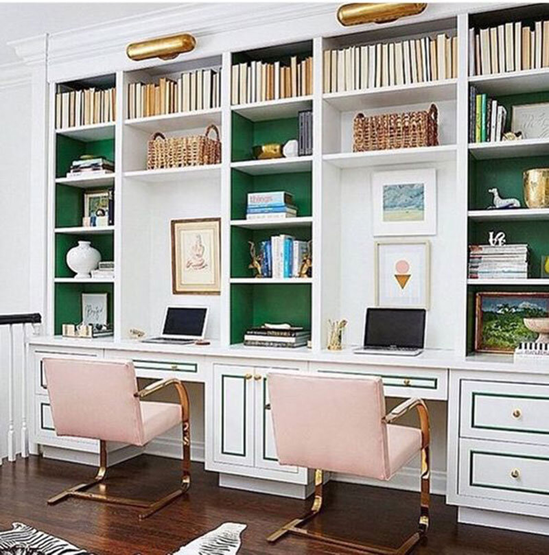
source: Amie Corley
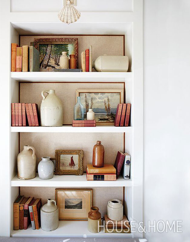
These built-ins are definitely something to aspire to. Notice the green extends to the insides of the bookshelf, which is definitely an option too. Now, I do like the look of books placed with the spine in on a shelf and it really works in this case. However, I would keep this technique for the upper shelves where you may not be able to read the titles anyway. Or, if you have questionable taste in books, definitely do this.
Design by Sivana D'Addazio via House and Home.
Ok, so there aren't a ton of books on this shelf, but look how nicely that textured backdrop looks trimmed out with ribbon! Those jugs aren't bad either.
3. Display Books by Size and Use Bookends
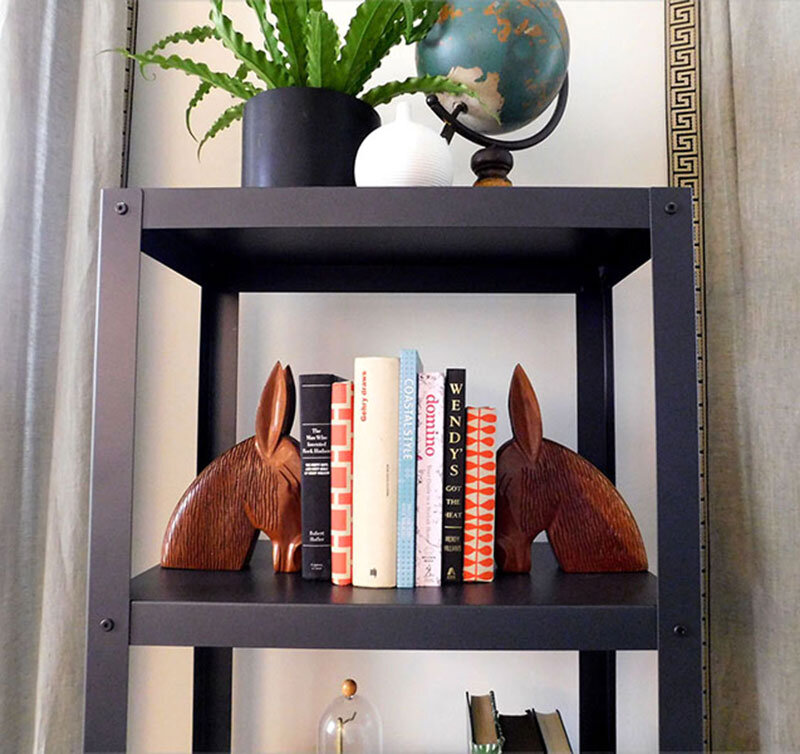
If you can adjust your shelves, I like to keep the top shelves a bit smaller. I keep all of my shorter paperbacks in these upper shelves. This uniformity and above eye level placement keeps you from focusing on this area too much. If you need almost the whole width of the shelf for books, adding in bookends is a great way to make it look more intentional. I like to keep the height of my books consistent between bookends.
Etsy is one of my favorite places to find quirky and affordable bookends.
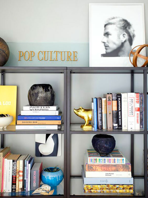
To get the most bang for your buck you can stack books large to small against the edge of the shelf and break up the bookend pair onto two different shelves. Have fun with the bookends, they don't have to be scholarly. You want to hook people with your quirky objects only to impress them with your great taste in literature.
I don't know where the other end of that pig is, but you get the idea. Design by Orlando Soria and Emily Henderson via My Domaine.
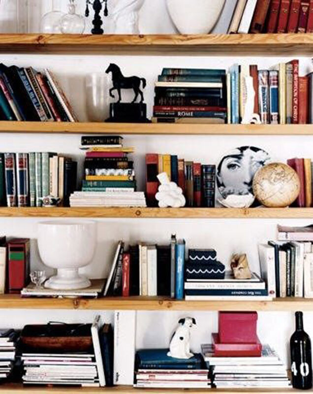
** Bonus Tip*** Don't forget you can stack and layer back to front and always lean some artwork if you have it.
Don't forget to have fun and get creative with it. Or just call me.
Adam Baron via Flickr
What is your favorite object on your bookshelf?

