Mixing Modern and Traditional in a Bathroom Renovation
I have a new bathroom renovation project to reveal and I thought I’d take this opportunity to share some techniques on how I combined styles in this space. It comes naturally to me and I wouldn’t design any other way, but I know there are some actionable ideas I can pick apart and share with you. It not only makes sense for a more visually interesting space, but it can help with resale value.
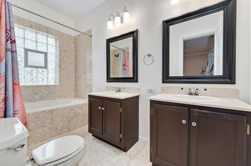
The condo was in an older building with lots of charm and the other rooms had been updated in a way that was consistent with the style of the building. However, it’s not uncommon for older homes to have been updated at different points by different people and have a haphazard mix of fixture style and quality. I actually kind of like walking into the before wondering who ever thought that was a good idea. Especially if I’m going to be the one hired to fix it!
You literally walked right into the toilet on your left as you entered. And so much dead space and lost opportunity with two separate vanities.
photo courtesy of Redfin listing
Our first goal in meeting with a contractor was to determine if the toilet could be moved. When we were told it could, I knew a 60” double vanity would fit perfectly on the wall along with it. The only window in the space was a glass block window in the shower. We were replacing the tub, tile surround and flooring so it made sense to add in a glass shower door so the space would feel much more bright and open.
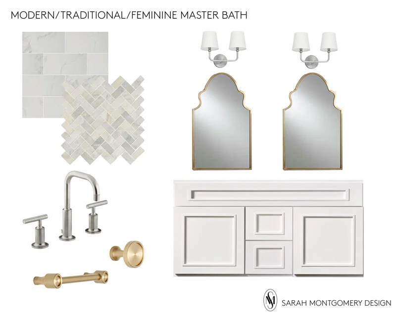
In choosing the tile and fixtures for the space, I knew the client wanted lots of lightness with marble and white. There is a ton of inspiration out there for this look, it’s pretty safe and has a good shelf life. How could I put together something that looked a little more custom and interesting that still had the same shelf life?
It’s possible and it’s all in the details!
photo by Margaret Rajic
Now that the shower would be visible with a glass door, I didn’t want to replace the tile with something small scale that would look too busy with the glass block window. We chose a large scale, 12”x24” Carrera look porcelain tile. We could have tiled the tub surround, but that tile would have been too large in scale for that area. We opted to add a molding and trim detail painted white. In some cases this would be more economical depending on the cost of the tile. Here it serves as a pretty detail that adds to the custom look and perceived value.
For the floor we used actual Carrera herringbone tile. It’s a real stone, thus porous and requires the extra step of sealing, but totally worth it for the look being that the house is older and has all the character! I also like this tile because it has warm and cool tones to it which helps when you plan to mix metals.
shower tile / floor tile / faucet / mirrors / vanity / sconces / hardware
I worked with a local kitchen and bath showroom on a semi-custom vanity. You can buy vanities in any price point everywhere online these days, but how do you know how the drawers open and if it’s cheap press board with a thin coat of veneer? This is something I highly recommend shopping for with a designer or at least in person, especially for a master bathroom. What you see is what you get in this instance while that is often NOT the case with online purchases.
For this vanity we were able to choose the size, finish, drawer and cabinet configuration and style, and legs. I love the detailing and I will never not put cute little legs on a vanity- no more toe-kick!
photo by Margaret Rajic
For the lighting, mirrors and hardware I opted to source outside of the kitchen and bath showroom. In fact, the lights and mirrors are not even exclusively meant for the bathroom which gives the space a more curated look. The arched mirror adds a feminine element but could easily be swapped out if this space were eventually in the hands of a bachelor.
The idea of the shaded sconces is also a more traditional look but to make sense with the modern faucets I needed the base to be very simple. No extra curves please. Another thing to take note of when specifying alternative light and mirror options for your bathroom is scale. I carefully measured the height of the sconces and mirror in relation to the ceiling height. If this ended up looking crowded it would have been a major MISS.
Lastly, I encourage mixing metal finishes in any space for a look that has more depth and intention. The finish on the more costly, permanent fixtures is Brushed Nickel. The items that added more of a decorative element like the mirrors, art, hardware and soap dispensers were where we chose to incorporate brass.
The hardware is from Rejuvenation and because it is more unique you can’t quite classify it as modern or traditional. It’s this small detail that helps bridge the gap between the two styles.
My style definitely leans more eclectic and colorful so I knew I could bring those elements in with the wall color and accessories.
photo by Margaret Rajic
The walls are painted Benjamin Moore’s Opal because I convinced my client that brunette’s look better in blush. In addition to reviewing color samples on the wall, I also search Pinterest for things like ‘best light blush paint color’ and ‘blush bathroom’ to see examples of the colors I’m thinking of in a finished space. This color turned out to be the perfect shade and tone and anything but baby pink.
I’ve loved this rug from Lulu and Georgia for years and I think it’s completely appropriate yet totally unexpected in this space.
I brought in the artwork from Anthropologie to stage with and the client actually ended up buying it all! Maybe I’m overthinking this, but is there something weird about delegating one larger piece of art for over the toilet? It’s like what did they do to deserve to go there? In this case these guys are ok, they have each other.
I think I’m just as happy with how this turned out as the client is to get ready here everyday. I truly believe what you surround yourself with affects how you see yourself and in this case the odds are looking pretty good!
What is your favorite element in this space?


