5 Tips for Filling Your Big Blank Wall
Figuring out what to put up on your walls can be very intimidating. There is a delicate balance to be had between original art, mass produced prints, vintage art and anything else you might hang on the wall. I try to incorporate a little of everything into my designs and chances are you have blank walls that could use some love too.
Here are my 5 tips for filling your big blank wall.
Mirrors are your friend.
Mirrors are a great solution for many reasons. They make a room look larger and reflect light. They also come in all styles, shapes and sizes. I think my first few apartments after college had mirrors at every turn. I was at my prime, but also because it’s an easy solution to fill a blank wall.
photo by Margaret Rajic
I usually suggest grounding mirrors over a piece of furniture and if you can, hanging them opposite a window or another focal point in the room so whatever it is can be enjoyed from another direction.
photo by Margaret Rajic
I would rarely select a plain rectangle or oval mirror, there are just too many interesting shapes and frames to choose from. Some mirrors are works of art themselves.
photo by Margaret Rajic
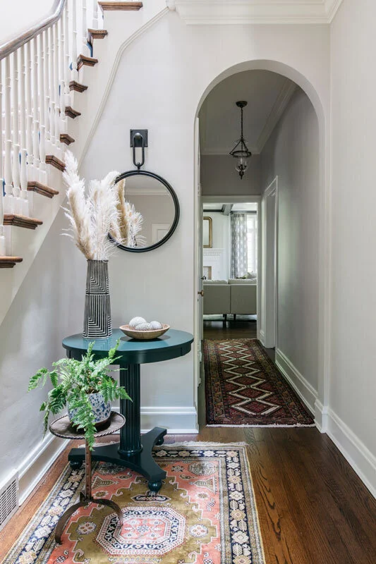
In this entryway we were able to take up more visual space on this awkward slice of wall by incorporating a mirror that has a decorative hanger.
When shopping online for mirrors use filters to search by shape, size and price. For anything oversized make sure to check how it ships to be prepared to receive the hefty packaging too. Don’t forget to check your local antique stores, there are always gems to be found!
Invest in artwork.
If my clients are open to it, I always encourage them to consider investing in some sort of art. But one of my favorite things a client can say to me is, “ We have collected or inherited a lot of art over time.” It might not even be my choice or taste, but if it is meaningful to the client, I will absolutely find a way to incorporate it into the design plan.
It was easy to incorporate this client’s antique portrait. photo by Margaret Rajic
If you’re starting from scratch, think of it more as a process and investment, rather than just the end result. The easiest way to start is to buy a piece each time you travel. It doesn’t have to be anything fancy, just something that reminds you of the experience that you might also like to look at when you get home.
When considering incorporating a mass produced print into your home decor, I think it’s very much ok to choose it based on color and pattern. I have a textile background so I have to admit this is what initially draws me to any artwork over the subject matter. Is it ok to say that out loud? I wouldn’t incorporate multiple large scale prints in one room, but you can definitely use them to fill one wall and bring together a color scheme.
In this client’s living room we had a ton of wall space and awkward window size and placement. We chose to make a wallpapered focal point for the large Minted print so it felt more layered and dynamic. We added to the clients collection of vintage Fornasetti plates for a plate display which creates texture and plays off the black and white of the wallpaper. Two original prints from the client’s travels add color and interest in the spot below the window. This is a great example of balancing different types of art in a space.
photo by Gene Yoon
Another good place to start looking for original art is in your community. With instagram, it’s even easier to find local artists without leaving your home. Try searching the hashtag, #yourcityartist. But I will encourage you to attend one craft or art fair a season. You can get to know local artists and see their work in person while drinking a beer! You may even consider commissioning them for the perfect piece. If you love their work, but it seems unattainable, ask if they offer prints.
In this client’s bedroom, we wanted the focal point of the room to be over the bed and to incorporate a lot of color. My client liked this piece, but was able to make the selection even more meaningful by visiting the artist, Kristi Kohut, in her studio. It’s a print, but elevated by the textured paper it’s on and the lucite box it’s framed in.
photo by Margaret Rajic
Here we utilized a piece by another successful (national) Chicago artist, Josh Young, to fill the space above this console. We incorporated a lot of color and pattern in this historic tudor living/ dining room and this piece was a perfect combination of traditional art with a dose of color and modern flair. While it is a print, the brushstroke is hand done by the artist.
photo by Margaret Rajic
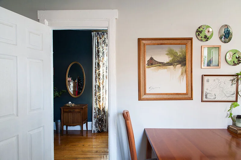
Vintage Art is another great option to consider. Every design of mine incorporates something vintage or antique. It adds character, patina and a collected look that newly designed rooms often lack. Scouring local shops for vintage art can be a time consuming task, but this is just a reminder to consider it and keep your eyes peeled. While the subject matter of the piece may not have personal meaning, there is something meaningful about having discovered the artwork, a one of a kind!
The husband and wife for this project had differing tastes in art. The husband preferred more traditional, formal art while the wife like to support outsider artists. I came across this piece at an antique store, by Gerald Nees, an Indiana man who was paralyzed and painted with his mouth. This is a more traditional scenic painting by an outsider artist AND it happens to be of the Chicago river! Total win.
Frame a series.
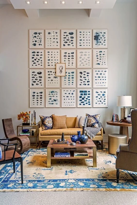
Too many poorly executed gallery walls can make a designer cringe, but when done correctly they are amazing. They take more time and consideration so that is a topic for another post. Framing a series is easier to pull off because repetition makes things look more intentional. There are lots of things you can think about framing, some you may already have.
I had this series of shadow puppet postcards I got at a stationary shop in NY over a decade ago. I never did anything with them until I rediscovered them during a move and decided they would make a great statement framed and hung together. Here you can see them hung in different ways in two of my homes.
photo by Margaret Rajic
photo by Emma Fialo
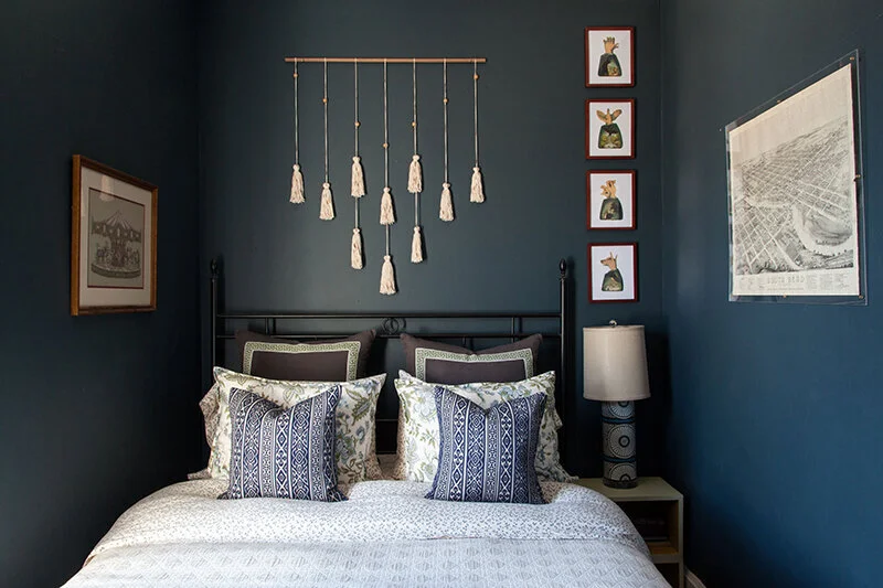
This framed series combines two of my very favorite things, animals and patterns. They are from the book Animal House by Catherine Ledner. I had the book for years and while I enjoyed pulling it out every now again, I was able to justify cutting out my favorite pages because I would enjoy them more this way. I think what makes them more interesting is the pattern on pattern so you should probably be considering wallpaper too!
photo by Emma Fialo
I also have some suggestions if you need to go searching for that series to fill your wall. I love Chairish for their print shop and selection of original art. They have great filters and you can search by 1, a pair, or a set of 3 or more. Etsy is also a great resource. You can search by print series or scour for vintage collections that might translate to a cool framed series. If you like a more contemporary look, Minted allows you to filter by art pairs, however most artists offer multiple works that relate. One King’s Lane also has a good art selection with a filter for multiples.
And just to push it a bit further, here is one of my favorite examples of a framed series. It’s layering folks!
Lean, stack and layer.
One of my favorite ways to display art is to lean and layer it. This is an especially good trick if you find yourself with a lot of little pieces. This doesn’t necessarily fill your big blank wall, but leaning and layering creates an impact all it’s own. I wouldn’t suggest having a large framed piece on the wall and then nearby having another piece that is much different in scale or subject matter. However if you switch it up by leaning and layering, it can be a successful juxtaposition.
Here we have a framed poster and then some layered items on top of the bar cabinet along the same wall. Nothing looks quite as random or lonely this way.
photo by Margaret Rajic
It can also be quite impactful to layer art in front of a mirror. If you love a certain piece and it wants to be the focal point, but is a tad too small, putting it in front of something larger like a mirror or leaning tray is a great way to still display it without it being disproportionate.
photo by Margaret Rajic
Art can also be leaned or hung on the back of shelves and is a great styling hack!
photo by Margaret Rajic
Group art like you mean it.
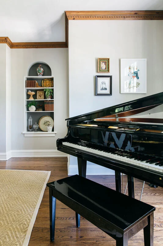
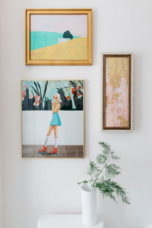
I’m not quite talking about a gallery wall, but in order to have variety on your wall space, it’s sometimes necessary to hang a few smaller pieces together. Generally, odd numbered groupings look best. I like for the frames to all be very different or exactly the same. It’s a good idea to vary the scale and shape and don’t be afraid to hang them close together.
photo by Margaret Rajic
photo by Margaret Rajic
You can also think about incorporating alternative items, like plates, mirrors, textiles, or small shelves into the mix. Once you get this technique down, I give you permission to attempt the gallery wall!
photo by Emma Fialo
Gallery ledges are also a great way to group art and objects with very little commitment. This is a great way to incorporate smaller framed personal photos. I like gallery ledges with a little depth to them so you have options for layering, 5” or 6” is ideal. You can get them just about anywhere, but if you want to consider a custom length, Etsy is the best resource for this.
This is a ton of information, I know! Some things become so intuitive to me, I amaze myself when I’m able to get it all out in a (hopefully) cohesive way. I know how intimidating it can be to think about filling a room with furniture and then tackling the blank walls. Hopefully this post encourages you to think outside the box, get creative and be intentional with your art and decor.
I’m always here to help, leave your questions in the comments or schedule you complimentary call with me!
